
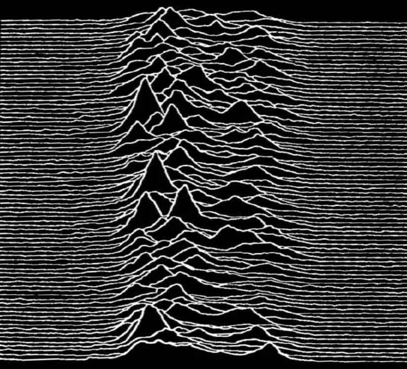
A visual, compositional, and critical analysis of the iconic minimalist album cover for Joy Division.
The cover of Joy Division's album Unknown Pleasures is one of the most recognizable examples of how graphic design has successfully incorporated technical drawings of scientific models, creating symbols of popular culture that have transcended decades. Designed by Peter Saville for the band's 1979 debut album, the composition is deceptively simple: it uses a series of repetitive patterns of hand-drawn white lines, wavy and irregular shapes against a black background. The minimalism envisioned by the designer has achieved a lasting presence; it has been reused on posters, clothing, and walls worldwide, generating visual culture behind a technical design. What makes it so appealing is not only its visual identity but also the concept behind it: an astronomical design that evokes a seemingly abstract graphic composition, leaving the viewer free to interpret it.
The designer had the brilliant idea of bringing to the world of design what is essentially a simple scientific visualization of radio waves emitted by a pulsar. Without getting too technical, it's a rapidly rotating neutron star that produces periodic bursts of radiation. The original graphic was published in an astronomy manual to illustrate how consecutive pulses captured by radio telescopes worked. Peter grasped the beauty of this composition, decided to remove the labels surrounding it, and, by inverting the image's contrasts, discovered its abstraction rather than its technical meaning. He managed to preserve its structural elegance, its power in visual repetition, but by removing it from context, he invited the viewer to interpret the work instead of analyzing it as a mere informative technical description; in other words, he found magic within the technical.
The composition is simple, yet it displays profound ambiguities; the cover is based on the reiteration of simple visual rhythms. Each horizontal line shares the same logic as the previous one; only the curvature and amplitude differ, making them unique and generating an irregularity that keeps the viewer attentive to every detail of the image. It is hypnotic, repetitive, and powerful. It encourages the eye to explore and find patterns within the repetition. The stark contrast between the lines and the background highlights this effect, making it appear natural even though it's completely foreign to the concept due to the use of a palette that doesn't exist in nature. The space of the counterforms plays a fundamental role, giving air and strength to this minimalist aesthetic of the composition.
The designer was able to find a connection between the music of Joy Division and the technical atmosphere he saw in this graphic. An austere, simple, and introspective sound for a minimalist, powerful, geometric, and technical design, resulting in a unique piece. While the image originates from astrophysics concepts, Peter's reinterpretation in a musical context transforms it into a symbol of mystery in popular culture. Those who have never seen this type of graphic only see an abstract landscape to explore with their eyes, one that accurately emulates both the music and the natural mountain ranges of our planet. The association is free and strong, and the meaning is abstract, so the free representation gives the composition a unique character.
The cover illustrates the immense power of design to reinvent and contextualize information, creating trends of meaning in something that might be perceived as purely theoretical or technical. Creating an image that functions as a piece of data, an abstraction, and a cultural icon is one of the highest achievements of design. Its appeal endures because it resists direct interpretation, yet remains completely memorable for the user. This ambiguity lends the work a unique meaning, transcending its initial technical interpretation to become an enduring icon in the history of human popular culture.